
2026 Color Trends: Why Every Paint Brand Picked a Neutral (And What That Means for Your Asheville Home)
We love tracking the annual Colors of the Year from the top paint brands, and while the array of colors is usually more of a mixed bag, in 2026, we’re seeing a common thread: neutrals.
After watching these announcements roll out and talking with clients at our Asheville showroom, the message is clear. People want spaces that feel grounded and calm. This year, warm neutrals are taking center stage as bold, statement colors fade into the background. People are craving spaces that actually feel like home.
Let's break down what each major brand chose and what it means for your next project.

Pantone: Cloud Dancer
Pantone went bold by going... white. Cloud Dancer is a soft, luminous white that caused quite a stir online. Some people loved the fresh start it represents. Others thought it was playing it too safe.
But Cloud Dancer is not meant to be the star. It’s a clean canvas that lets your furniture, art, and personal style take center stage. In a world that feels constantly overwhelming, there's something calming about a space that breathes.
Where this works: If you're planning a kitchen remodel and want your beautiful cabinetry or statement backsplash to shine, Cloud Dancer on the walls creates the perfect backdrop.

Benjamin Moore: Silhouette (AF-655)
Benjamin Moore went the opposite direction with Silhouette, a rich espresso with subtle charcoal notes. They describe it as reminiscent of a perfectly tailored suit. This is a mature color that adds instant sophistication.
The choice reflects a growing trend we're seeing here in Asheville: homeowners are moving away from stark blacks and embracing warmer, deeper browns. These colors feel lived-in and elegant at the same time.
Where this works: Silhouette is stunning in a dining room or primary bathroom where you want drama without heaviness. Pair it with cream-colored countertops from our showroom and brushed gold hardware for a truly luxe look.

Sherwin-Williams: Universal Khaki (SW 6150)
Sherwin-Williams picked Universal Khaki, a warm tan that Sue Wadden, their director of color marketing, describes as balancing "comfort and functionality." It's the kind of neutral that works with almost everything.
This shade has subtle yellow undertones that make spaces feel inviting without being trendy. It's not trying to be bold or make a statement. It's just... reliable. And sometimes that's exactly what you need.
Where this works: Universal Khaki is perfect for open-concept homes where you need one color to flow through multiple spaces. It pairs beautifully with our natural wood cabinetry options and works with both cool and warm accent colors.

Behr: Hidden Gem (N430-6A)
BEHR kept things interesting with Hidden Gem, a smoky jade green. Erika Woelfel from BEHR says it "feels very intentional" but still works as a neutral because it's desaturated enough not to overwhelm.
This is for clients who want color but aren't ready to commit to something bright. Hidden Gem nods to the biophilic design trend—bringing nature indoors—without looking too literal.
Where this works: Try Hidden Gem in a home office or reading nook. It creates focus without being stark. Pair it with natural stone tile from our showroom for a cohesive, grounded feel.

The Supporting Cast
Several other brands made picks worth mentioning:
Dunn-Edwards: Midnight Garden – A “deep, muted green” inspired by biophilic design
Glidden: Warm Mahogany (PPG1060-7) – A deep red-brown that's bold yet timeless
Dutch Boy: Melodious Ivory (313-2DB) – A soft, creamy beige that feels nostalgic and elevated
Valspar: Warm Eucalyptus – Naturally restorative and serene
What These Choices Tell Us About 2026
Looking at all these colors together, a few trends become clear:
Earth tones are back: Browns, tans, warm greens—these colors connect us to nature and create calm spaces.
Neutrals got more interesting: We're moving beyond gray. The new neutrals have warmth, depth, and personality.
Comfort matters more than flash: After years of bold, Instagram-worthy spaces, people want rooms that feel good to live in every day.
There's room for personal choice: The variety in these picks means you're not locked into one "right" direction. Choose what works for your life.
How to Choose the Right 2026 Color for Your Space
With so many different directions, how do you decide?
Start with your light: Asheville homes vary wildly in natural light depending on location and orientation. Bring home samples and look at them throughout the day. Warm tans can look amazing in morning light but muddy in afternoon shade.
Think about your furniture: If you have warm wood tones, cooler neutrals like Hidden Gem provide nice contrast. If your furniture leans cooler, Universal Khaki adds warmth.
Consider the room's purpose: Bedrooms and bathrooms can handle deeper, more dramatic colors. Living spaces benefit from lighter neutrals that make the room feel bigger.
Trust your gut: You have to live with this color every day. If a trend doesn't feel right, don't force it.
The 2026 color trends give us a lot to work with. Whether you're drawn to the serenity of Cloud Dancer, the sophistication of Silhouette, or the grounded warmth of Universal Khaki, there's a direction that will work for your space.
And if you need help figuring out which one fits your project, that's what we're here for!
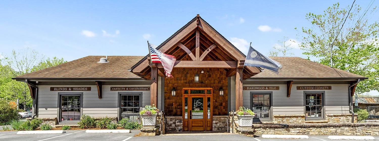
Stop by the HomeSource Design Center showroom to view our displays of home finish materials and products, or contact us to schedule an appointment with one of our expert kitchen & bath designers.
Let’s Talk!
Visit us and shop our extensive range of tiles, counters, cabinets, and more.